Sunday, 9 May 2010
Thursday, 6 May 2010
Wednesday, 5 May 2010
Perhaps a Salon-esque Vibe?

Union 105 of Chapeltown opened a commemorative exhibition last month. Commemorative not only of numerous local artists in the LS7 and LS8 area, but also of the French Salon exhibition, first established in the 18th century.
I'm sure many are aware of the particular curation of the Salon exhibition, hanging many works clustered together in an almost celebratory effect.
However, on the topic of our level two exhibition, Lost Property that's due to kick off next week, and thinking in the case of curation, perhaps there are a few features of the Salon exhibition appropriate for our consideration.
As to why I think certain characteristics of the Salon would be so appropriate is simply the lost property theme we've all agreed to employ. Exactly how would the interior of a lost property room if it were, for some very strange reason, filled with lost artworks? Most probably stacked on top of each other, jumbled together around the edge of the floor space, perhaps a little numbered tag hanging off each one.
Obviously, I'm suggesting we take the whole lost property thing that literally. Yet, what if we were to employ a similar kind curation as the Salon. Clustered, but not jumbled; in no way discrediting the artworks.
However, I did hit a slight problem when pondering over this idea. How many works due to be exhibited are NOT going to be two-dimensional works? How many students have requested space, other than wall-space to exhibit their work? Quite a lot. I think I can remember all of two works at the Union 105 Salon exhibition tucked away in the corner or against a wall somewhere, and therefore, perhaps its such not a viable idea.
Although, there was another feature in this exhibition I thought may be a credible idea for our show. Each of the works in the Salon were numbered, instead of the name of the artist, their piece, and the date of its creation displayed under each of numerous artworks.
Considering we too, have many artists exhibiting within the same show, and not only displaying there works but stacks of promotional material, which are most probably in great danger of littering the art space, maybe we should utilize a similar kind of numbering system?
Could this be where your found index drawers come in, Emily?
Friday, 30 April 2010
Clashing in Curating
On my most recent visit to Leeds Art Gallery, I was overwhelmed by one particular room containing part of the group exhibition Between Kismet and Karma, I was overwhelmed, in an unfortunate way, by two pieces in particular.
My criticism is not of the actual works, in fact they were rather overwhelming in a good way, if only you were given the chance to fully appreciate them. No, the fault lies in the hands of the curator.
The problem which occurred in the exhibition confronted me as soon as I entered the space, overwhelmed by a sort of white noise. However, once I got over the shock and approached the work I realised this was most probably NOT the intention of either artist.
Artist Yasmine Kabirs had contributed her video piece, The Last Rites to the exhibition, which was accompanied with a music score. However, on the other side of the plaster board Shilpa Gupta had her piece installed, In Out Time, Singing Mobile Microphones, consisting of two microphones on either side of a pendulum- like swinging pole. Unfortunately for Gupta that's about all the viewer could establish as the sound clashed and fought of Kabirs.
Its reasonable to believe that this is a common problematic in the whole curating business. When you given numerous artworks for a show and expected to employ some method or theme. The curating of these works, I presume, must have been in some way in relation to their materiality, and considering most works in our show first began their journey under a brief of Materiality, there is chance of us making the same mistake.
Although, another reason to the clashing placement of these works may have been due to technical reasons. Perhaps, it was just alot easier to have two pieces close together so they could run of the same equipment. However, I think it may be worth it if we established ways of working around the work instead of the logistics.
Just like creating an art work, adhering to a rigid method or orientation in curating won't always work. Sometimes your best to go with instinct. If it doesn't work for you 'but it will do', the audience are probably going to feel the same way.
Thursday, 25 March 2010
Can the work adapt to the space? Can the space adapt to the work?
Whilst working on my current series of paintings in my studio space, I've constantly been clearing up, organising things into piles and neatly placing them in inconspicuous corners.
To be honest, these acts are no more really than a mere OCDesque nature of mine. However, recently I've realised how beneficial this could be in relation to my work and the space in which it will eventually be exhibited.
Every completed painting, I've carefully displayed for myself on a white plasterboard wall, and with my studio space fairly void of personal trinkets, this is the only visual object I have left for myself to sit and reflect upon.
As mundane as it sounds, this white wall with my painting attached to it could as easily be placed in the Art in Unusual Spaces donated shops in Leeds Plaza Shopping Centre. That's with my hope that our exhibition space will eventually maintain spic and span white walls, and not because I have any great appreciation of the white box syndrome of an exhibition space, but because that's what I've predicted and subconsciously been working towards. God help me if we don't!...Or my painting, rather.
This whole procrastination of your work adhering to the space has been intricately discussed by artist Daniel Buren (1979), who claimed that when a work sits in its studio it is in it's moment of absolute reality. With this in mind Buren brings forward two solutions: either the 'definitive place of the work has to be the work itself' or the creator 'imagines' the place where their work will end up. Although, the former, to me, seems to relate more so to site-specific work, and the latter adheres more to my tactic of predicting white plasterboard walls. Yet, the situation I've imagined is generic, a complete stereotype (Cotter,2006).
But that's the real problem our curating committee are having here. Gathering works from 48 artists that have been mainly resolved before having the opportunity to visit the site, and placing them in a space that, hence the name Art in Unusual Spaces, is not a complete stereotype.
At this point I think the only solution to this dilemma is adhering curation tactics to the decided name of our exhibition, Lost Property, adopting this idea that basically, its all a bit lost.

Buren (1979), 'The Function of the Studio' in: Doherty, C (ed) Contemporary art, From Studio to Situation, London, Black Dog Publishing
Cotter(ed)(2006), Daniel Buren,Intervention II, Works in Situ, Oxford, Modern Art Oxford
To be honest, these acts are no more really than a mere OCDesque nature of mine. However, recently I've realised how beneficial this could be in relation to my work and the space in which it will eventually be exhibited.
Every completed painting, I've carefully displayed for myself on a white plasterboard wall, and with my studio space fairly void of personal trinkets, this is the only visual object I have left for myself to sit and reflect upon.
As mundane as it sounds, this white wall with my painting attached to it could as easily be placed in the Art in Unusual Spaces donated shops in Leeds Plaza Shopping Centre. That's with my hope that our exhibition space will eventually maintain spic and span white walls, and not because I have any great appreciation of the white box syndrome of an exhibition space, but because that's what I've predicted and subconsciously been working towards. God help me if we don't!...Or my painting, rather.
This whole procrastination of your work adhering to the space has been intricately discussed by artist Daniel Buren (1979), who claimed that when a work sits in its studio it is in it's moment of absolute reality. With this in mind Buren brings forward two solutions: either the 'definitive place of the work has to be the work itself' or the creator 'imagines' the place where their work will end up. Although, the former, to me, seems to relate more so to site-specific work, and the latter adheres more to my tactic of predicting white plasterboard walls. Yet, the situation I've imagined is generic, a complete stereotype (Cotter,2006).
But that's the real problem our curating committee are having here. Gathering works from 48 artists that have been mainly resolved before having the opportunity to visit the site, and placing them in a space that, hence the name Art in Unusual Spaces, is not a complete stereotype.
At this point I think the only solution to this dilemma is adhering curation tactics to the decided name of our exhibition, Lost Property, adopting this idea that basically, its all a bit lost.

Buren (1979), 'The Function of the Studio' in: Doherty, C (ed) Contemporary art, From Studio to Situation, London, Black Dog Publishing
Cotter(ed)(2006), Daniel Buren,Intervention II, Works in Situ, Oxford, Modern Art Oxford
Labels:
daniel buren,
exhibition,
site-specific,
studio
Thursday, 25 February 2010
The Effects of Various Viewpoints on the Human Psyche
Last Friday a few of us took a trip up to Sheffield to see the current group exhibition, Hybrid , in which each artist has explored in their work a relation between art practice and science.
The exhibition was segregated in a number of different locations around the city centre, some which had seemed to have ended or non existent at all! However, among the spaces we visited we did manage to locate some artwork.
Located in Sheffield institute of arts gallery we discovered a few people gathered around watching a performance piece taking place in the corner of the open-plan exhibition space, Princess Clock Timing by artist Sarah Spanton. However, as I stood watching the performance my eye couldn't help drifting over to another character sitting solemnly in the middle of the space, his head burrowed in the palms of his hands.
The character situated in the middle of the project space was Paul Digby's Styrofoam sculpture, Man.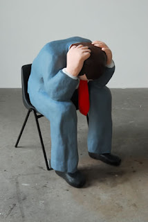 The fact that I was instantly intrigued by the Styrofoam man despite its momentary conflict with Spanton's performance installation here is something very successful about the way Digby manages to lure the audience in with such a simplistic sculptural form. Digby explores the context of nostalgia combined with an atmosphere of unreality, or dream-like imagery in his use of comic-like imagery to investigate the relation between visual communication and psychology.
This particular rendering of the human form in his sculpture piece is further investigated in a series of four works in gouache on paper. In contrast to the use of the spatial in Digby's sculptural piece, where the sculpture sits in isolation, only accompanied by the chair he is installed upon, These works on paper communicate upon the relation between our mentalities and our surroundings.
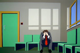
 Digby keeps to a very specific graphic form allowing him to focus on the effect of various viewpoints and different forms of perspective in his 2 dimensional works and the relations to human emotion. The communication of angst and despair is immediately realized when surrounding objects and buildings protrude within the geometrical space, almost as if reaching out of the paper and confronting the audience, whilst the solitary man (whom finds himself present in each of the four situations) sits in the foetal position, overwhelmed by the spatial he finds himself in.
What Digby also ensures to apply to in his studies are surroundings typical mundane, everyday life. The effect on emotion therefore entirely relies on the artist's play with perspective and viewpoints. This is clearly defined in the works that the artists had chosen to display out of his broad collection, and too, the order in which he has chosen to display the paintings. As you pass the first two works Waiting Room and Buildings you are confronted with the protruding perspectives and a sense of angst and despair. However, when moving on to view the third work of the series you are confronted with a viewpoint that plays on the contrary.
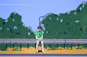 In the third painting Hard shoulder we become confronted by our Man having been taken out of everyday surroundings and placed on a hard shoulder in front of greenery. The location itself bares relation to a sense of hope and optimism contrasting with the other entirely industrial settings. This sense of elevation from the subject's despair is in fact communicated in a number of ways. The relation between the figure's clothing and surroundings also convey the intended mood. Whereas, in the other three works the figure is dressed in a brown-grey suit, in Hard shoulder the figure is conveyed in a green smock that corresponds with the greenery in the background. Moreover, the sitter seems to have managed to uplift himself to some degree out of his favoured foetal position and straighten his back, relieving the sense of restraint displayed in the other figurative poses.
Yet, what really strikes me is Digby's clever use of viewpoint. Whilst before, we were discomforted by the protruding perspective, Digby now employs the flat-painterly aspect in full proportion. As the pictorial space works flat, over a horizontal plane, we are given relief and allowed time to contemplate the imagery.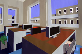 Paul Digby's work is highly resolved in our relation to our everyday lives and our sense of psych. Visiting his work has brought a powerful sense of confrontation between our sense of selves and how we overlook the constant working of our mentalities within even the most routinely aspects of our daily lives. A must see!
The exhibition was segregated in a number of different locations around the city centre, some which had seemed to have ended or non existent at all! However, among the spaces we visited we did manage to locate some artwork.
Located in Sheffield institute of arts gallery we discovered a few people gathered around watching a performance piece taking place in the corner of the open-plan exhibition space, Princess Clock Timing by artist Sarah Spanton. However, as I stood watching the performance my eye couldn't help drifting over to another character sitting solemnly in the middle of the space, his head burrowed in the palms of his hands.
The character situated in the middle of the project space was Paul Digby's Styrofoam sculpture, Man.
 The fact that I was instantly intrigued by the Styrofoam man despite its momentary conflict with Spanton's performance installation here is something very successful about the way Digby manages to lure the audience in with such a simplistic sculptural form. Digby explores the context of nostalgia combined with an atmosphere of unreality, or dream-like imagery in his use of comic-like imagery to investigate the relation between visual communication and psychology.
This particular rendering of the human form in his sculpture piece is further investigated in a series of four works in gouache on paper. In contrast to the use of the spatial in Digby's sculptural piece, where the sculpture sits in isolation, only accompanied by the chair he is installed upon, These works on paper communicate upon the relation between our mentalities and our surroundings.

 Digby keeps to a very specific graphic form allowing him to focus on the effect of various viewpoints and different forms of perspective in his 2 dimensional works and the relations to human emotion. The communication of angst and despair is immediately realized when surrounding objects and buildings protrude within the geometrical space, almost as if reaching out of the paper and confronting the audience, whilst the solitary man (whom finds himself present in each of the four situations) sits in the foetal position, overwhelmed by the spatial he finds himself in.
What Digby also ensures to apply to in his studies are surroundings typical mundane, everyday life. The effect on emotion therefore entirely relies on the artist's play with perspective and viewpoints. This is clearly defined in the works that the artists had chosen to display out of his broad collection, and too, the order in which he has chosen to display the paintings. As you pass the first two works Waiting Room and Buildings you are confronted with the protruding perspectives and a sense of angst and despair. However, when moving on to view the third work of the series you are confronted with a viewpoint that plays on the contrary.
 In the third painting Hard shoulder we become confronted by our Man having been taken out of everyday surroundings and placed on a hard shoulder in front of greenery. The location itself bares relation to a sense of hope and optimism contrasting with the other entirely industrial settings. This sense of elevation from the subject's despair is in fact communicated in a number of ways. The relation between the figure's clothing and surroundings also convey the intended mood. Whereas, in the other three works the figure is dressed in a brown-grey suit, in Hard shoulder the figure is conveyed in a green smock that corresponds with the greenery in the background. Moreover, the sitter seems to have managed to uplift himself to some degree out of his favoured foetal position and straighten his back, relieving the sense of restraint displayed in the other figurative poses.
Yet, what really strikes me is Digby's clever use of viewpoint. Whilst before, we were discomforted by the protruding perspective, Digby now employs the flat-painterly aspect in full proportion. As the pictorial space works flat, over a horizontal plane, we are given relief and allowed time to contemplate the imagery.
 Paul Digby's work is highly resolved in our relation to our everyday lives and our sense of psych. Visiting his work has brought a powerful sense of confrontation between our sense of selves and how we overlook the constant working of our mentalities within even the most routinely aspects of our daily lives. A must see!
Labels:
2-D,
angst,
cartoons,
despair,
gouache,
graphics,
optimism,
painting,
Paul Digby,
perspective,
psychology
Monday, 8 February 2010
If Only it Wern't for the Frames
Momentarily, the Stanley & Audrey Burton Gallery in the Leeds University Parkinson building are holding an exhibition containing drawings by Wilhelmina Barns-Graham.
I firstly visited the exhibition briefly last week and remember not feeling too intrigued by the work. So anyway, I went back this morning to try and figure out why it seemed so...dull.
I've concluded that its not quite a fault in the work itself. The mixed media sketches portrayed a kind of objective perception towards the subject of landscapes and townscapes, with a linear expression created mainly in pencil, enhanced by a tonal oil wash. In fact,defined only by primary linear markings, the drawings seemed to almost provide the essence of a blue-print.
This seemed to be the overall theme of Wilhelmina Barns-Graham's work; to undermine the idea of an overwhelming enigmatic quality that landscape has been credited for in the subject of painting throughout art history. And she's done it well.
Whilst walking through the small exhibition space that holds her work, the curator has categorised the drawings in such a way that we travel through the artist's experimentation with the subject of minimisation, starting for quite brightly coloured oil paintings to a collection a small pen drawings consisting only of a few lines to represent the movement of a wave.
However, I think the problem major problem with the exhibition was the way in which these drawings were each displayed in frames. Although the frames were simplistic, some with natural wood borders, others even more simplistically painted white, its the way that behind a glass frame the drawings seem too polished. There's a feeling that you're walking around a history museum rather than an art exhibition. The essence of the artist's trace is lost!
Subscribe to:
Comments (Atom)

